Private support.
Made for real life.
The visual and verbal system for Q: an affirming, privacy-aware AI companion and practical wellbeing space for LGBTQ+ people and allies.
Mission & Values
The foundation of every design decision we make.
Our Mission
"Your private space for LGBTQ+ wellbeing and personal reflection. We provide intelligent support, safe conversations, resources, and guidance for LGBTQ+ individuals and allies."
Secure & Private
Privacy is part of the product experience: clear controls, high-privacy defaults, local AI where available, and honest boundaries about cloud features.
Built with Empathy
Our intelligence features exist to support, not dictate. Responses must always be compassionate, supportive, and culturally competent regarding LGBTQ+ issues.
Connected Community
While private, we also facilitate connection to peer knowledge and safe, inclusive community resources when the user is ready.
Tone of Voice
How we speak to our users in UI copy, marketing, and AI responses.
We Are
- Welcoming: "I'm here for you—always." Creating a non-judgmental space.
- Clear: Direct, simple language. Navigating identity can be complex; our UI shouldn't be.
- Affirming: Validating user experiences and identities without reservation.
- Protective: Explain privacy choices plainly without promising that every feature is offline or end-to-end encrypted.
We Are Not
- Clinical/Cold: Avoid overly medicalized or detached language.
- Presumptive: Never assume a user's pronouns, identity, or journey stage.
- Pushy: Never force disclosure or push users toward resources they aren't ready for.
- Diagnostic: The AI never diagnoses; it only observes, reflects, and supports.
Logo & Assets
The glossy Q mark, Pride-spectrum energy, and calm product surfaces.
Q Intelligence
Primary Lockup (Dark Background)
In-App Header / Light Mode
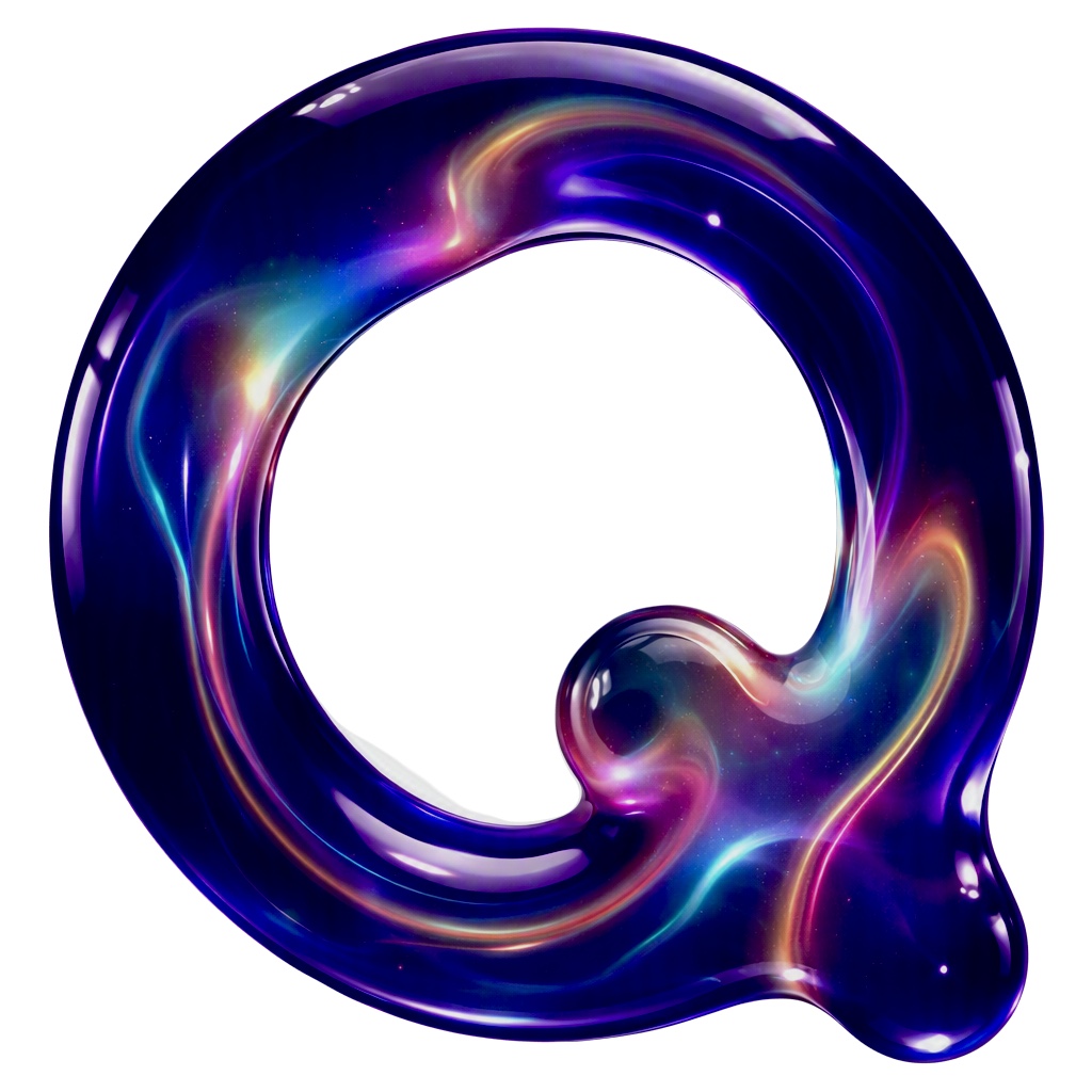
The "Cosmic Q" Render
The primary logomark is a 3D, glossy 'Q' containing a cosmic nebula effect. It represents the infinite possibilities of self-discovery, fluidity, and the depth of inner reflection.
- Colors: Deep indigo base with vibrant magenta, cyan, and gold nebula swirls.
- Texture: High-gloss glass/liquid appearance with specular highlights.
- Usage: Best used on dark backgrounds (`#0F091F`) with `mix-blend-mode: screen` or `lighten` to allow the black background of the render to drop out.
Color Palette
Derived from the cosmic logo and clean UI mockups.
UI Base Colors (Light Mode)
White
#ffffff
Cards & Panels
App Background
#f8fafc
Main layout bg
Q-50 (Tint)
#f5f3ff
Chat bubbles, Active states
Text Secondary
#64748b
Text Primary
#0F091F
Headers, base text
Brand Accents (The Nebula)
Primary Purple
#7c3aed
Links, active tabs, icons
Cyan
#06b6d4
Logo highlight, UI accents
Magenta
#ec4899
Logo highlight, UI accents
Pride-spectrum action gradient
Premium CTA buttons
Semantic
Active/Secure
#10b981
Helpline/Alert
#ef4444
Typography
Inter-led system typography keeps Q warm, direct, and legible across the app.
Inter — display
Display & HeadersUsed for the main brand name, large section headers, and promotional content. Its rounded geometric shapes reflect the circular nature of the logo.
H1 - Bold 48px/3rem
Q Intelligence
H2 - Semibold 30px/1.875rem
Welcome back
H3 - Medium 24px/1.5rem
Your private space
Inter — interface
Body & UIA clean, modern sans-serif with excellent legibility for chat interfaces, journaling, and navigational elements. Replaces standard system fonts.
Chat Bubble - Regular 16px
Hi, I'm Q. I'm here for you—always.
Body Text - Regular 15px
Local AI can run on compatible devices. Hosted AI and search are clearly identified when they use online services.
UI Small / Tabs - Medium 14px
Iconography
Soft, rounded stroke icons. 1.5px to 2px stroke width. Unfilled by default.
UI Components
Pill-shaped buttons, glass-like gradients, and soft cards.
Buttons
Subscribe / Premium CTA
Helpline Action
Chat Suggestion Pills
Chat Input Bar
Q may make mistakes. Check important info.
Your private space
This is your space. You're in
control of what stays here.
Local AI
All processing happens
on your device.
Memory controls
You decide what Q remembers
—or forgets.
Application Architecture
Based on the Q Intelligence repository structure.
Frontend (React / Vite)
- Framework: React 18+ (TSX)
- Styling: Tailwind CSS v3
- State: React Context
- Navigation: Authenticated SPA views
AI Integration
- Local AI: WebLLM (In-browser)
- Memory: Vector search
- Safety: Prompt injection guards
Backend (Supabase)
- Auth: Supabase Auth
- Database: PostgreSQL
- Security: Strict RLS Policies
- Server: Express / Node.js
Testing & DevOps
- E2E: Playwright
- CI/CD: GitHub Actions
- Hosting: Vercel